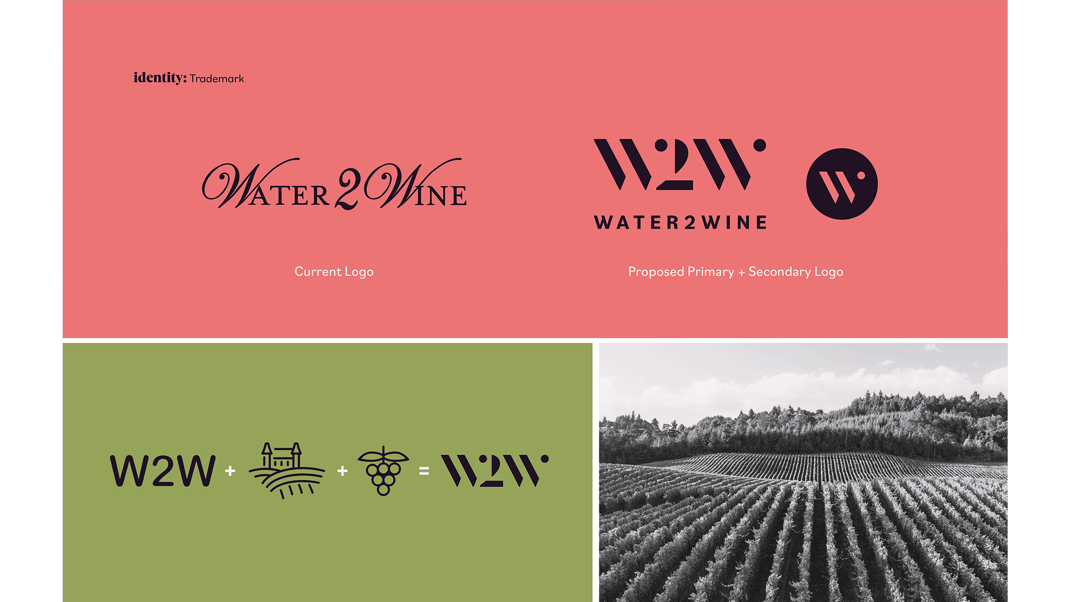
A fresh, modern rebrand for Water2Wine, a beloved urban winery.
PROJECT SCOPE: Positioning, Trademark Development, Art Direction, Brand Identity, Packaging, Copywriting
PROJECT DURATION: February 2022–March 2022 (2 months)
TOOLS USED: Miro, Mural, Figma, Illustrator, Photoshop, InDesign
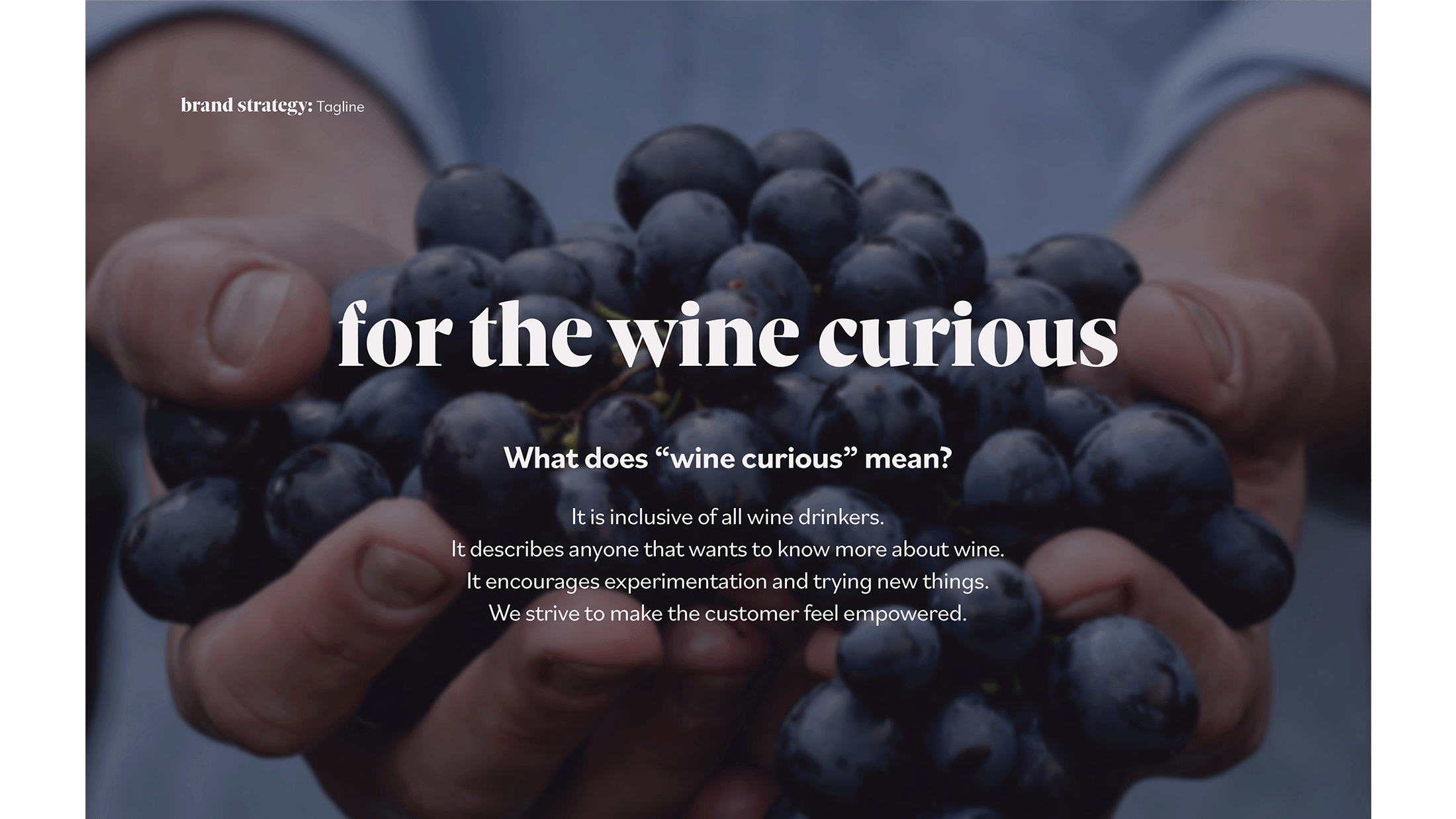
Water2Wine is small-batch urban winery franchise that creates an inclusive environment for all wine drinkers. They let the customer guide their own unique wine experience, whether that means exploring new wines to try, being educated about wine, or creating your own custom batch with friends. The goal was to create an identity that appeals to their target audience that feels more inclusive and less gendered while creating a cohesive look and feel across multiple platforms.
COLLABORATORS:
MALLORY BLACKWELL: Design Research, Brand Identity, Trademark, Packaging, Social Media, Copywriting
MAISIE ANDERSON ↗: Design Research, Brand Identity, Website, Copywriting, Ad Campaign
VICTORIA NIEVES ↗: Design Research, Copywriting, Ad Campaign
NAIM CARBAJAL: Design Research
RECOGNITION:
GOLD, Integrated Brand Identity—AAF District 10 Addy’s 2023, Regional
GOLD, Integrated Brand Identity—AAF SA Addy’s 2023, Local
SILVER, Packaging—AAF SA Addy’s 2023, Local
SILVER, Packaging—Graphis New Talent Annual 2023, International


SOCIAL MEDIA STRATEGY
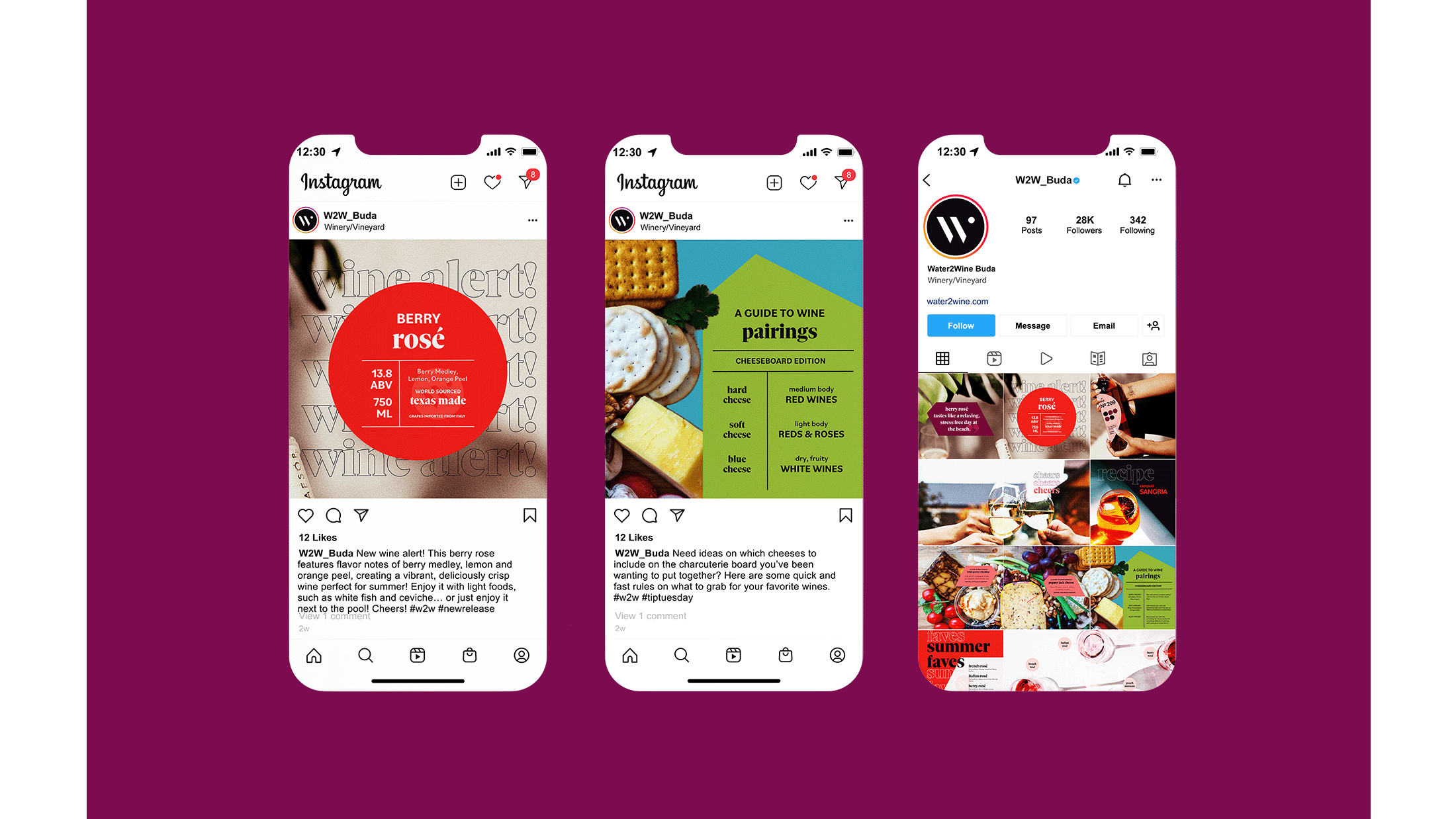
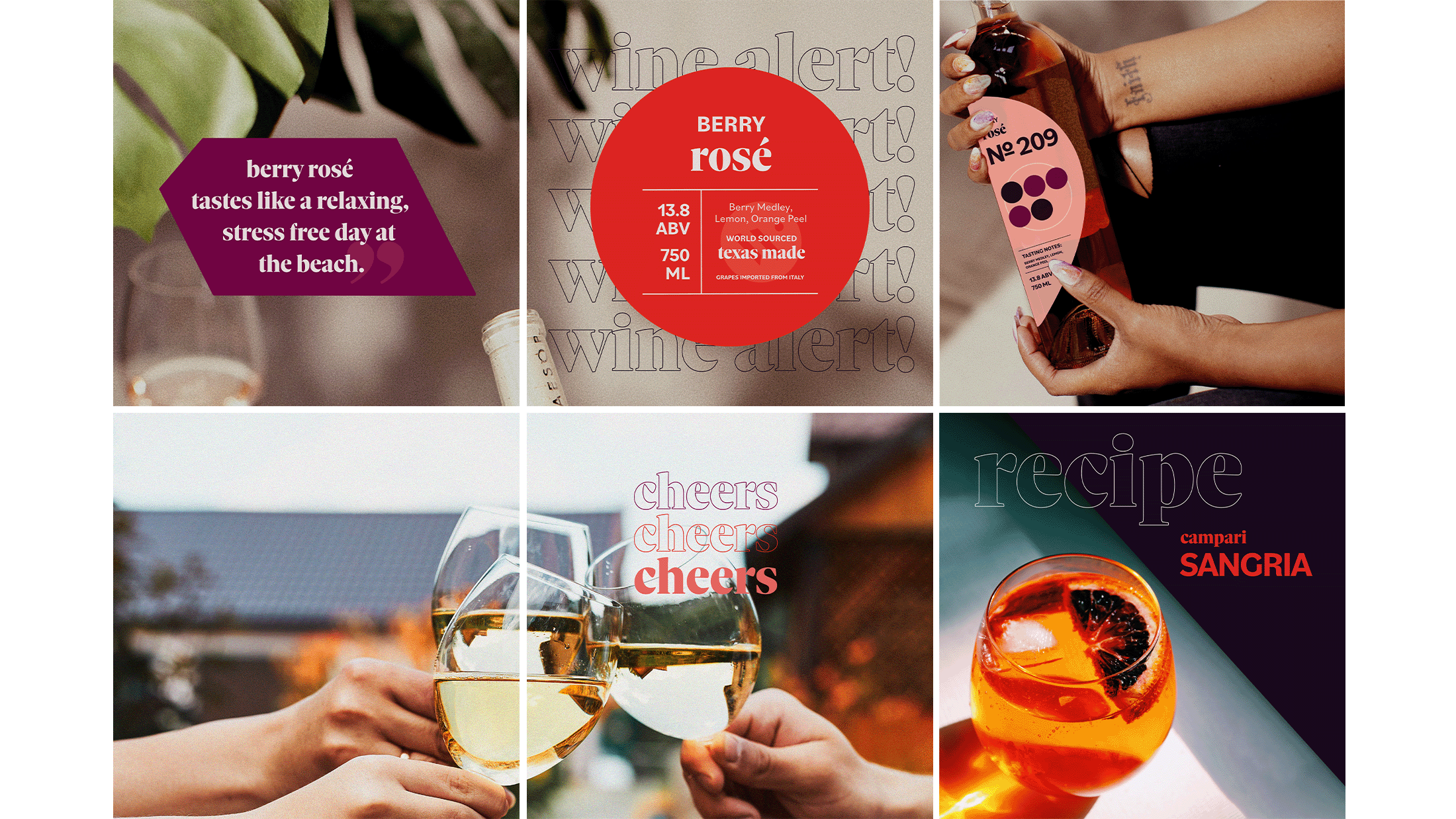
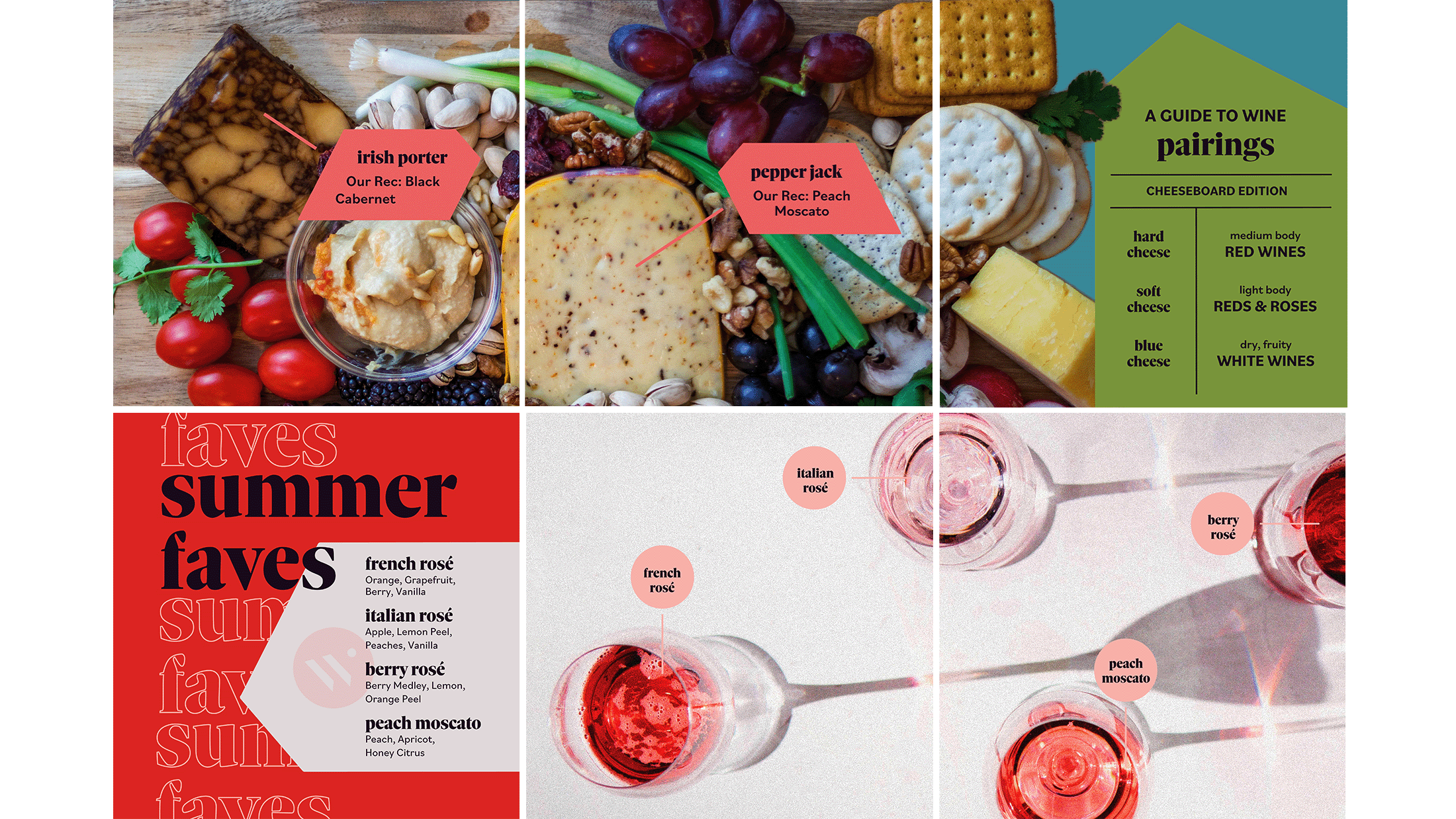
Water 2 Wine’s social media not only teaches followers easy to understand information about wine but also gives viewers an understanding of the unique experience Water 2 Wine offers it’s customers. The feed contains posts about Water 2 Wine’s new wine batches and releases, seasonal offerings and wine tips that encourages engagement from new and returning customers.
PACKAGING STRATEGY
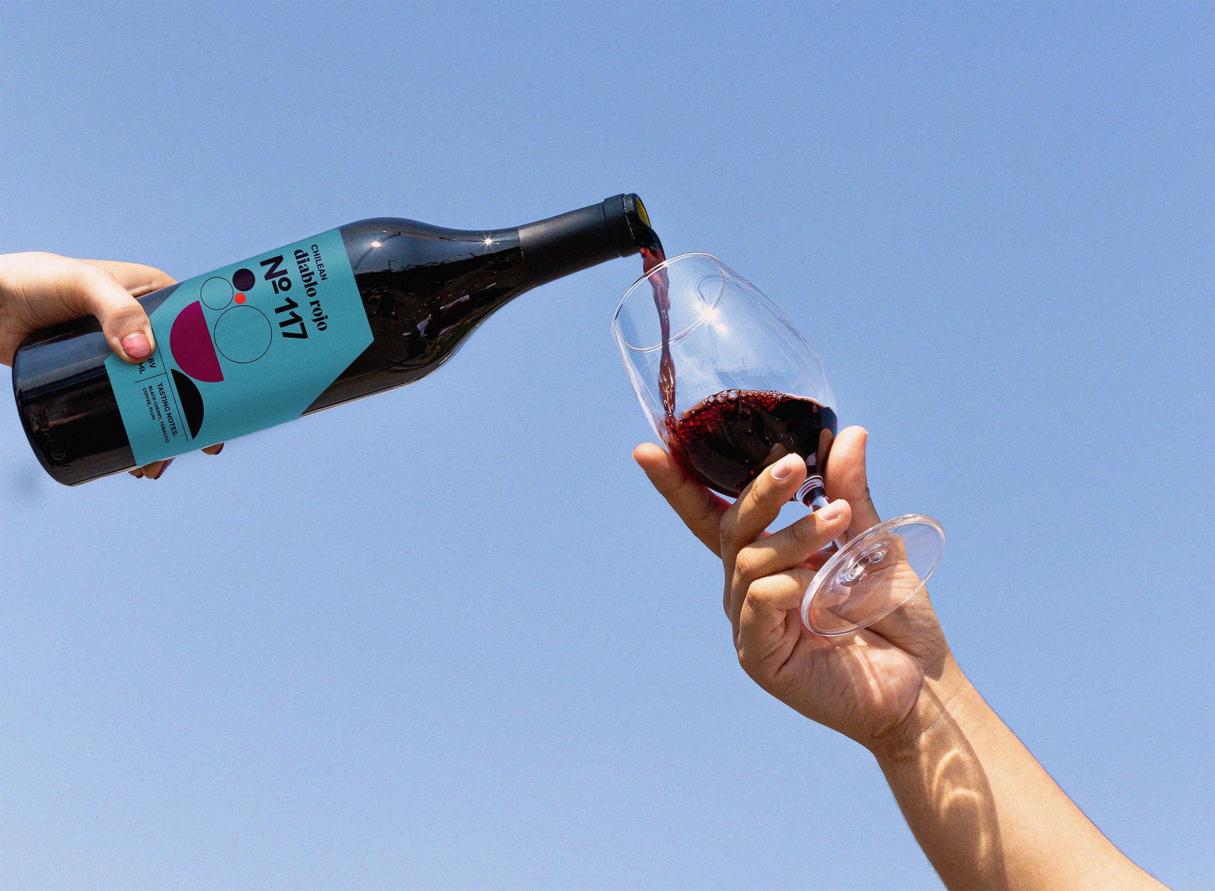
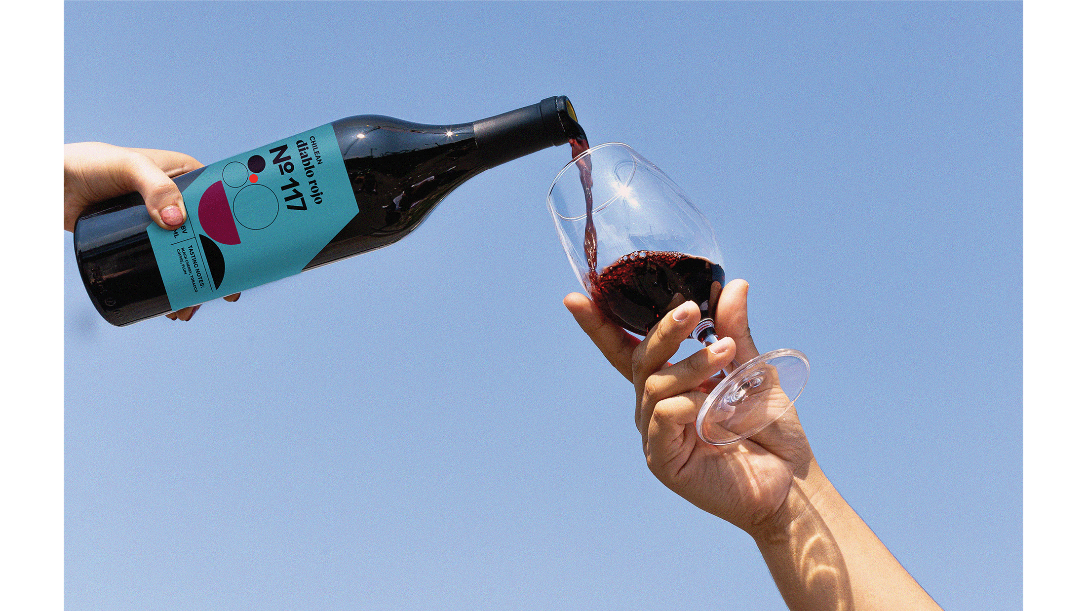
In order to keep track of W2W’s large selection, each category has a numerical system, 1-99 for whites, 100-199 for reds, and 200-299 for rosés allowing for ease of organization and the ability to free up numbers when/if any wines are discontinued. Each label lists and has a unique illustration hinting at the flavor notes for each wine, allowing consumers to easily choose something that appeals to their individual palate. The shape of each label is taken from the forms of the logo.


WEBSITE STRATEGY
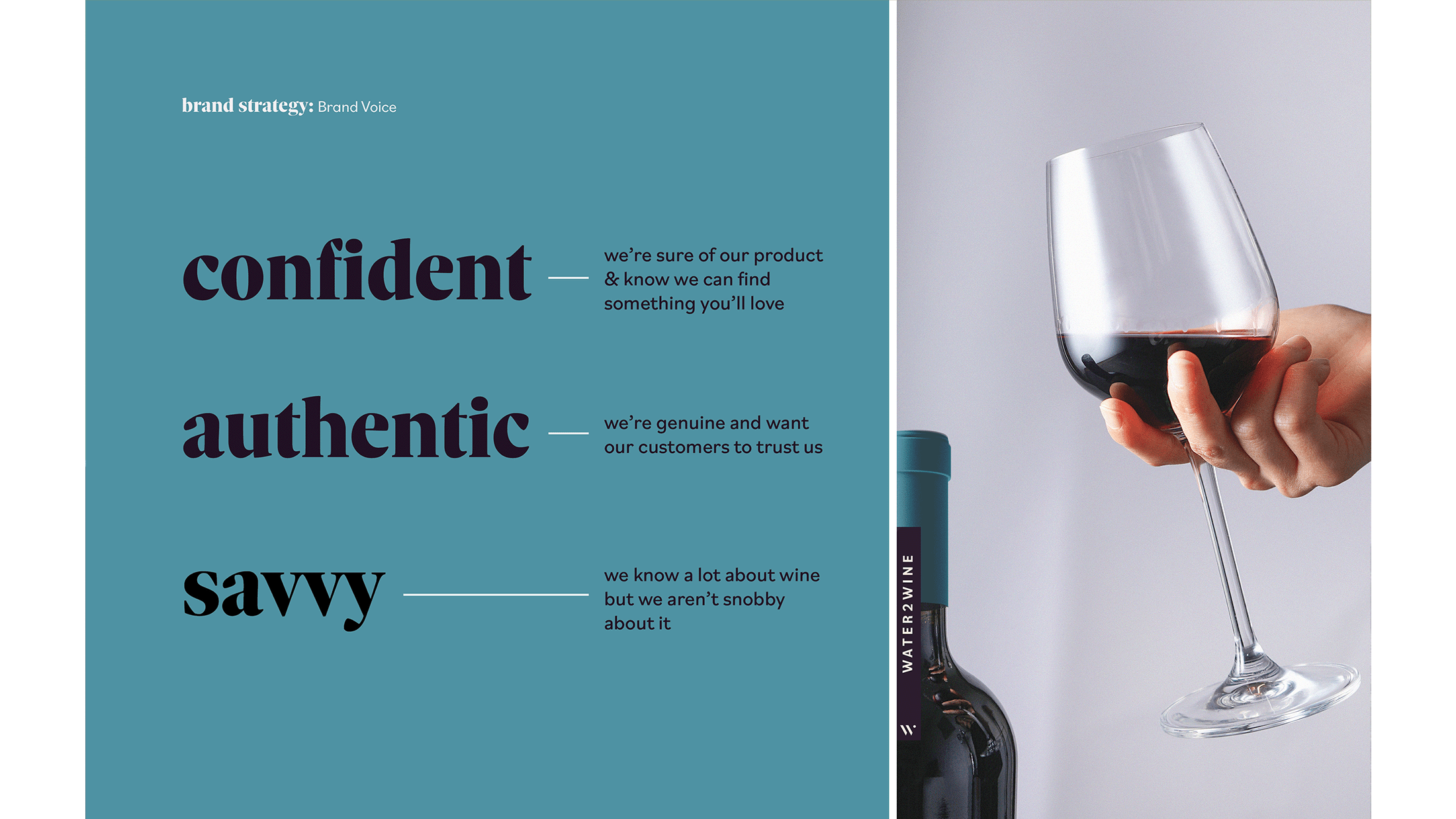
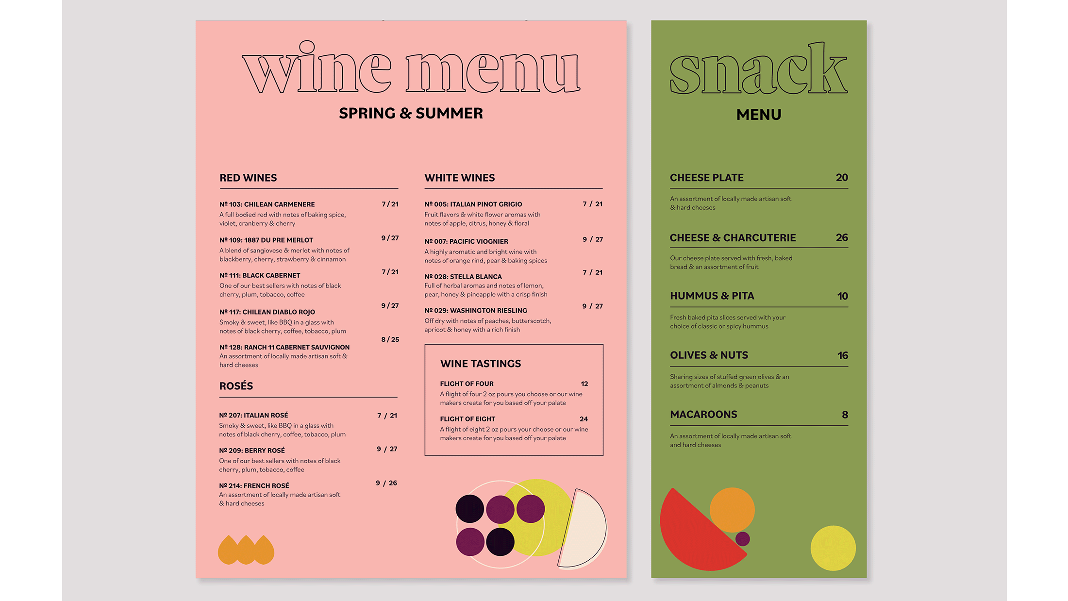
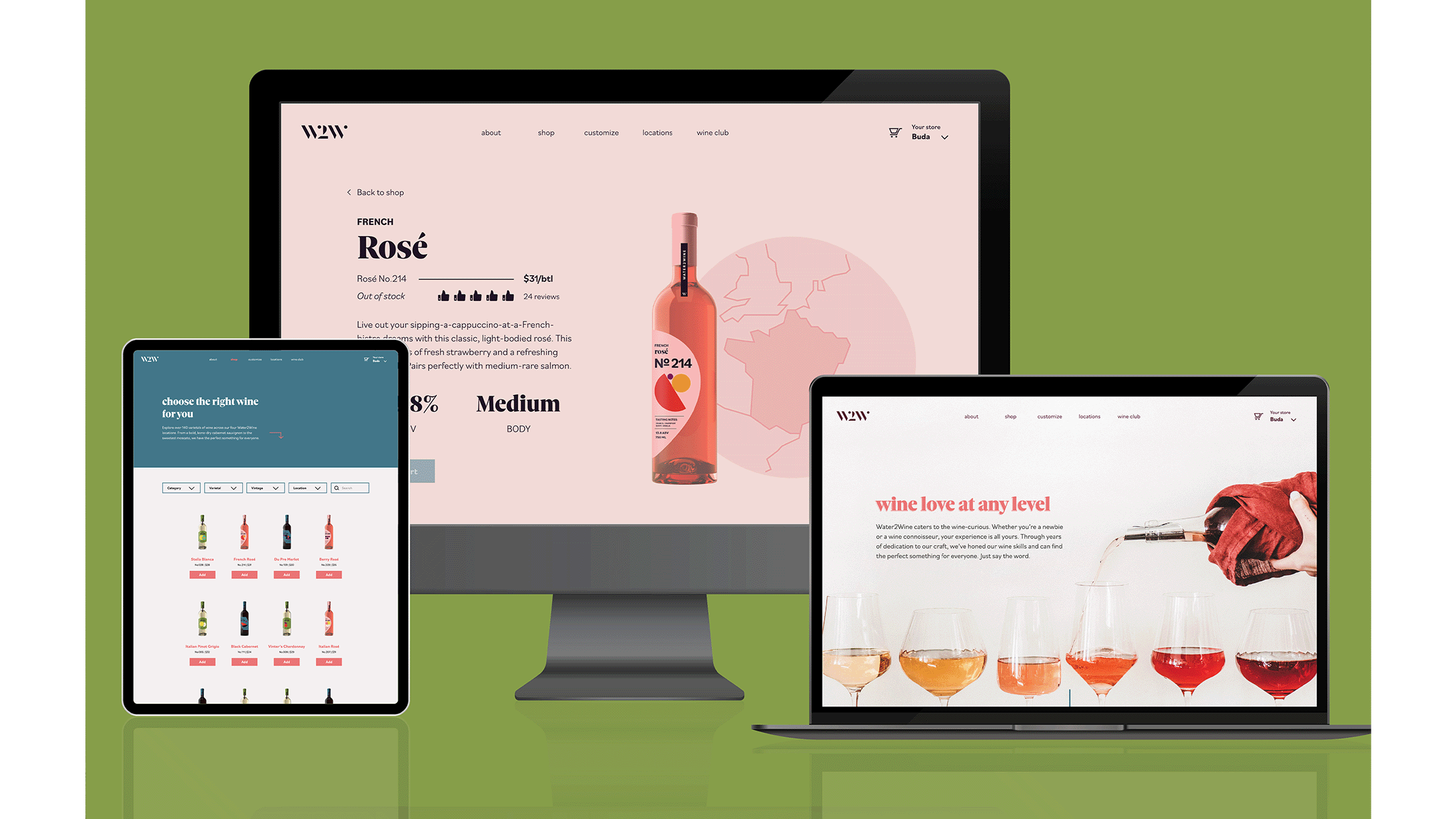
Feeling personal and inviting was important for the website, from the photography to the copywriting. Our playful and conversational writing style showcases the fun and confident attitude of the brand. Water2Wine’s mission of getting to know you and finding what you love lent itself to creating an online quiz to help new wine drinkers find a wine or style of wine they might like to try. The quiz focused on being slightly educational while still being understandable to those without lots of experience with drinking wine.
WHAT I LEARNED:
This was my first extensive project working with a team and I learned how much I value collaboration. We each brought different skillsets and perspectives to the table and I believe it made the brainstorming and execution process more efficient and effective. I was blown away by what we were able to accomplish in the 8 weeks we had on this project.
WITH MORE TIME & RESOURCES:
I would love work on in store branding and an environmental graphics system.
